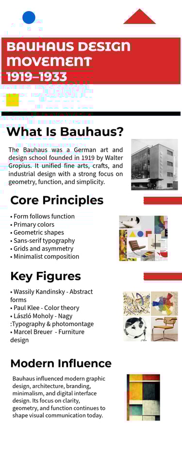
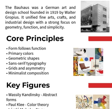
Graphic Design - Poster Study: Bauhaus Movement
The Bauhaus movement emphasizes structure and functional beauty principles that shape my approach to layout, branding, and visual communication. By researching and applying Bauhaus methods, I reinforced my studio’s commitment to clean, intentional, research-driven design.
Tools Used
Adobe Express
Design Focus
• Layout composition
• Color theory
• Typographic hierarchy
• Historical design research
• Grid-based organization
• Visual clarity and balance
Role
Graphic Designer Visual Researcher
Project Highlights
Researched and translated Bauhaus history into a clear, visually accessible infographic.
Applied Bauhaus-inspired grid systems, primary colors, and minimalist composition to create a balanced layout.
Developed strong typographic hierarchy to guide viewers through key principles, figures, and influences.
Curated imagery and visual elements that reinforce geometric forms and modernist aesthetics.
Focused on clarity, structure, and visual balance core values of I. Forma Studio’s design identity.
Demonstrated expertise in layout design, color theory, and historical design interpretation using Adobe Express.
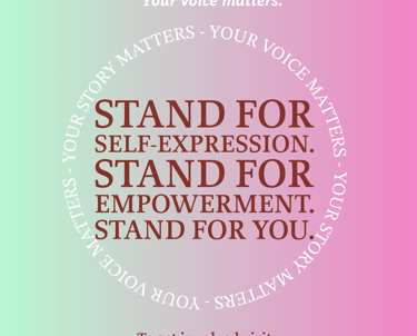
Advocacy Flyer - YPAP Pride Collaboration
This advocacy flyer was created in partnership with the YPAP Pride initiative to visually communicate LGBTQ+ inclusion, representation, and community support. The goal was to design a piece that celebrates identity while raising awareness for Pride-focused programming and resources. The visual direction combines bold color, clear typography, and inclusive imagery to create an accessible, emotionally resonant message.
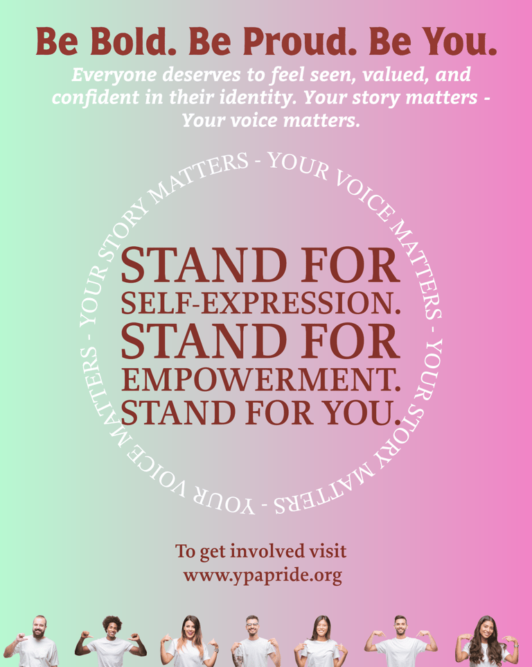
Role: Visual Designer
Tools: Adobe Express
Focus: Typography, color gradients, layout, inclusive design
Project Highlights – YPAP Pride Advocacy Flyer
Designed an advocacy flyer centered on LGBTQ+ inclusion, empowerment, and visibility through bold color, typography, and intentional composition.
Created a soft gradient palette to symbolize diversity, unity, and fluid identity in a modern, uplifting visual style.
Used circular typography to reinforce the message that your story matters and to create a sense of movement and community.
Incorporated inclusive imagery to reflect representation and belonging across identities.
Developed a clear visual hierarchy that supports both emotional impact and informational clarity.
Balanced advocacy messaging with accessible design, ensuring readability and visual harmony.
Demonstrated ability to merge storytelling, social impact, and design principles into a cohesive, inspiring communication piece.
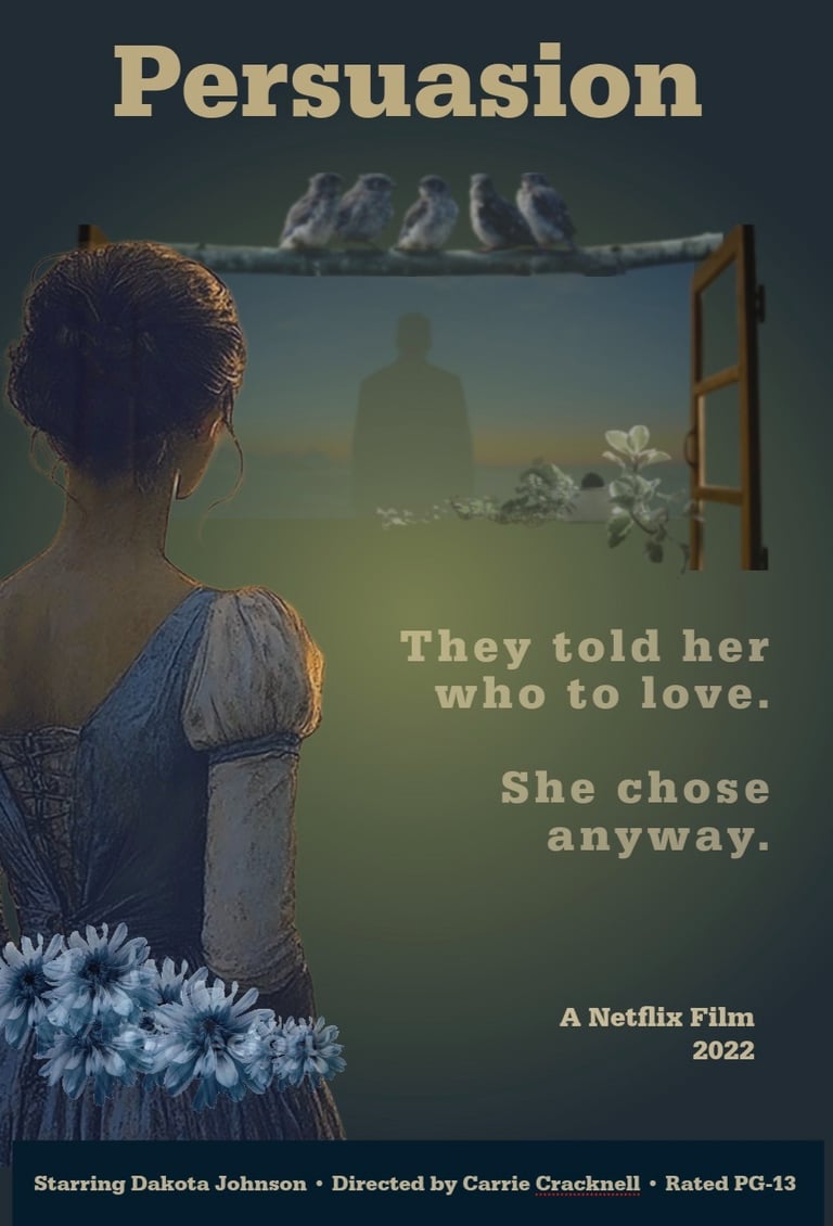
Film Poster: Persuasion (2022)
This project aligns with I. Forma Studio, because my analysis of Persuasion reflects the same core values that shape my design work: clarity, intentional structure, human-centered storytelling, and attention to overlooked voices. Through close reading and feminist interpretation, I approach Austen’s text in the same way I approach design, uncovering patterns, analyzing emotional impact, and communicating deeper meaning with precision and purpose.
Tools: Adobe Express
Focus: Composition, contrast, symbolism, visual hierarchy
Role: Visual Designer
Project Highlights – Persuasion Film Poster
Designed a modern reinterpretation of Persuasion using symbolism to communicate themes of longing, independence, and emotional constraint.
Used contrast, lighting, and layered imagery to create a cinematic atmosphere that reflects the film’s tone.
Applied visual hierarchy to guide the viewer from the protagonist to the symbolic background elements and the tagline.
Integrated period-inspired textures and color palette to evoke historical drama while keeping a contemporary aesthetic.
Composed a balanced layout that blends illustration, photography, and typography into a cohesive visual narrative.
Demonstrated ability to translate literary themes into strong visual storytelling through intentional design choices.
Crafted an original tagline that reinforces character agency and emotional depth.
BÓRA Logo Design
A bold symbol representing identity, confidence, and movement.
The BÓRA brand mark was created as a standalone symbol designed to express the core of the brand: individuality, confidence, and self-identity. The shape uses fluid motion, modern curves, and a dynamic “B” structure that captures both movement and expression. This symbol is used across packaging, apparel, marketing campaigns, and social identities as a recognizable visual anchor for the brand.
The design is minimal, scalable, and intentionally abstract - making it adaptable for fashion, digital media, and lifestyle branding.


Tools Used
Adobe Express
Canva
Adobe Color (palette development)
Design Focus
Icon design & minimalist symbol creation
Form balance & shape refinement
Curve structure and visual harmony
Scalability for apparel & digital formats
High-contrast shapes for clear reproduction
Adaptation for dark/light backgrounds
Visual identity system integration
Logo Specifications
HEX Color: #000000
Typeface: Custom Brush Script Logomark
Font Category: Modern Brush / Hand-lettered Script
Role
Brand Designer · Creative Director · Visual Identity Developer
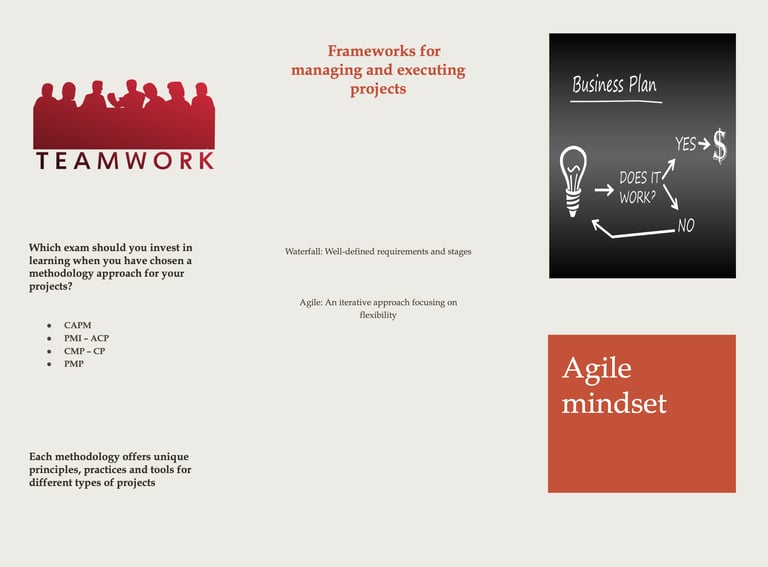
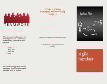
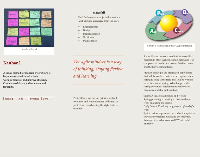
PM Frameworks Brochure - Graphic Design Project
Visual guide explaining Agile, Waterfall, Scrum & Kanban.
This brochure was designed as a visual learning tool to explain common project management frameworks, including Agile, Waterfall, Scrum, and Kanban. The goal was to transform technical concepts into a clean, approachable, and easy-to-read layout using typography, color, and balanced composition. The brochure combines informational design with visual storytelling and shows my ability to take complex content and turn it into a structured, aesthetic deliverable.
Role:
Layout Design · Educational Design · Visual Communication